Image Guide
These guidelines should direct the focus of all images created for the site. Visual examples and instruction on how to construct the appropriate compositions of individual shots are provided, as well as examples of inappropriate usage.
General Guidelines
These guidelines apply across the board for all images used in the site.
Images should always:
- Be crisp and clear with bright colors
- Be authentic, true, and student inspired
Images should not:
- Include shots that are muted in color
- Include shots with blown out highlights
- Include graphics such as clip art or overlaid text
Header Backgrounds
1300x600 (minimum size)
Shots A (home) and B (general) provide visual reference for the style of Header Backgrounds that should be included in the site. Header Background images will automatically be overlaid with the green gradient.
Appropriate Usage:


Header Backgrounds should always:
- Show wide, atmospheric, and expansive landscape views, or
- Show details of environment, such as grass, trees, leaves
Header Backgrounds should not:
- Focus on one individual as a portrait
- Include too many subjects, or busy composition
Homepage Features
800x570 (minimum size)
Shot C provides visual reference for the style of Homepage Feature images that should be included in the site.
Appropriate Usage:

Homepage Feature images should always:
- Include friendly people that give a good first impression of Castleton
Homepage Feature images should not:
- Include black and white photography
- Include a focal point at the edge of the image (due to cropping for various screen sizes)
Header Images
1250x475 (minimum size)
Shot D provides visual reference for the style of Header Images that should be included in the site. Header Images will always be overlaid with a dark gradient, as well as the title of the page and a brief introduction.
Appropriate Usage:

Header Images should always:
- Help support the content of the page by being in-line with the subject matter (location, specific program, etc)
- Include friendly people that lead in well to the page's content, or
- Include wide, atmospheric, and expansive landscape views
Header Images should not:
- Inhibit overlaid text with busy composition
- Include a focal point at the edge of the image (due to cropping for various screen sizes)
Flexible Callout Images
375x210 (minimum size)
Shot E provides visual reference for the style of Flexible Callout images that should be included in the site.
Appropriate Usage:
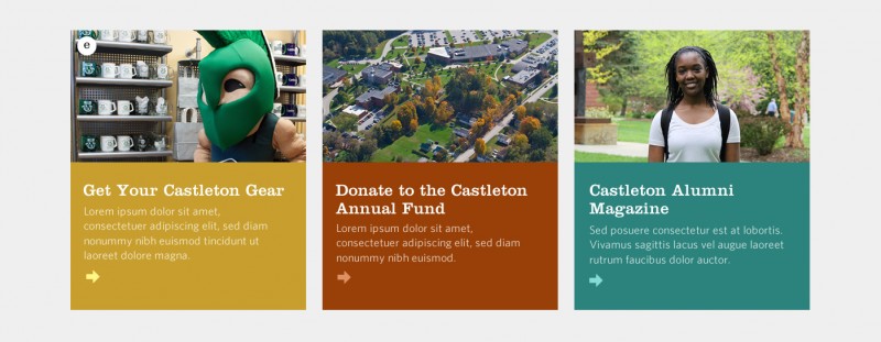
Flexible Callout images should always:
- Help support the content of the callout by being in-line with the subject matter (location, specific program, etc)
Photo Gallery Images
375x210 (minimum size)
Shot F provides visual reference for the style of Photo Gallery images that should be included in the site.
Appropriate Usage:
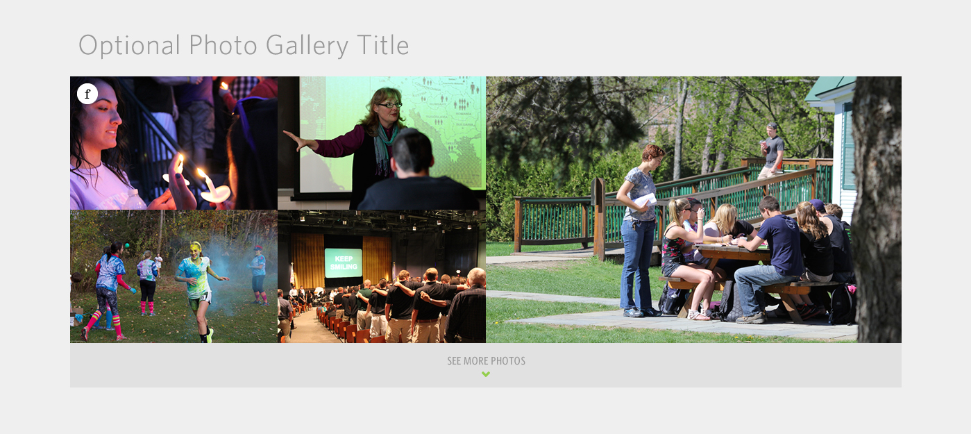
Photo Gallery images should always:
- Help support the content of the page by being in-line with the subject matter (location, specific program, etc)\
We Are Castleton Images
1400x830 (minimum size)
Shot G provides visual reference for the style of We Are Castleton images that should be included in the site.
Appropriate Usage:

We Are Castleton images should always:
- Include friendly people that give a good overall impression of the student body and activities at Castleton
We Are Castleton images should not:
- Be overly specific, confusing, or misrepresent the student body and activities at Castleton
Featured Story Images
600x385 (minimum size)
Shots H and I provide visual reference for the style of Featured Story Images, both in-content (H) and above content (I), that should be included in the site.
Appropriate Usage:
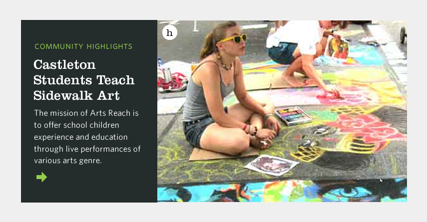
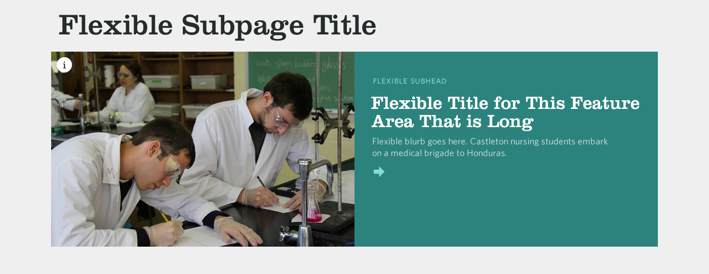
Featured Story images should always:
- Help support the content of the featured story by being in-line with the subject matter (location, specific program, etc)
Featured Story images should not:
- Include a focal point at the edge of the image (due to cropping for various screen sizes)
Alumni Story Images
305x225 (minimum size)
Shot J provides visual reference for the style of Alumni Story images that should be included in the site.
Appropriate Usage:

Alumni Story images should always:
- Focus on one individual as a portrait
Alumni Story images should not:
- Be candid shots (preferably; we recognize that user-submitted shots cannot be controlled)
Arts Features
1400x495 (minimum size)
Shot K provides visual reference for the style of Arts Features that should be included in the site.
Appropriate Usage:

Arts Features should always:
- Help support the content of the page by being in-line with the subject matter (location, specific program, etc)
Upcoming at the Casella Images
585x350 (minimum size)
Shot L provides visual reference for the style of Upcoming at the Casella images that should be included in the site.
Appropriate Usage:
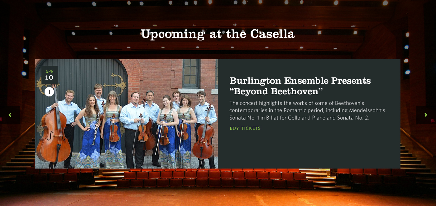
Upcoming at the Casella images should always:
- Help support the content of the callout by being in-line with the subject matter (location, specific program, etc)
Upcoming at the Casella images should not:
- Include a focal point at the edge of the image (due to cropping for various screen sizes)
Upcoming at the Casella Wallpapers
1400x700 (minimum size)
Shot M provides visual reference for the style of Upcoming at the Casella wallpaper images that should be included in the site.
Appropriate Usage:
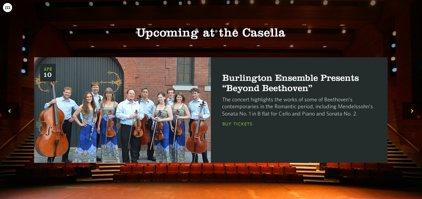
Upcoming at the Casella wallpaper images should always:
- Include wide, atmospheric, and expansive views of the Casella Theater
Upcoming at the Casella wallpaper images should not:
- Focus on one individual or a group of people
- Include busy content that could distract from the upcoming events callouts
Castleton People Wallpapers
1400x950 (minimum size)
Shot N provides visual reference for the style of Castleton People wallpaper images that should be included in the site.
Appropriate Usage:
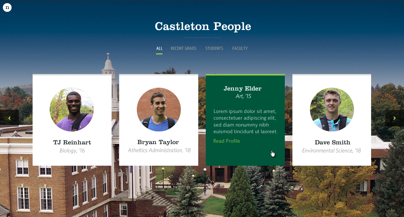
Castleton People wallpaper images should always:
- Include wide, atmospheric, and expansive views of campus
Castleton People wallpaper images should not:
- Focus on one individual or a group of people
- Include busy content that could distract from the Castleton People callouts
Upcoming Events Images
800x510 (minimum size)
Shots O and P provide visual reference for the style of Upcoming Events images that should be included in the site. Upcoming Events images will always be overlaid with a dark gradient, as well as the name of the event and a brief introduction.
Appropriate Usage:
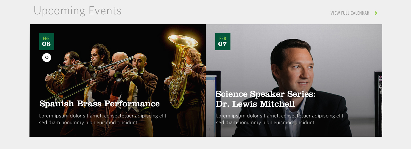
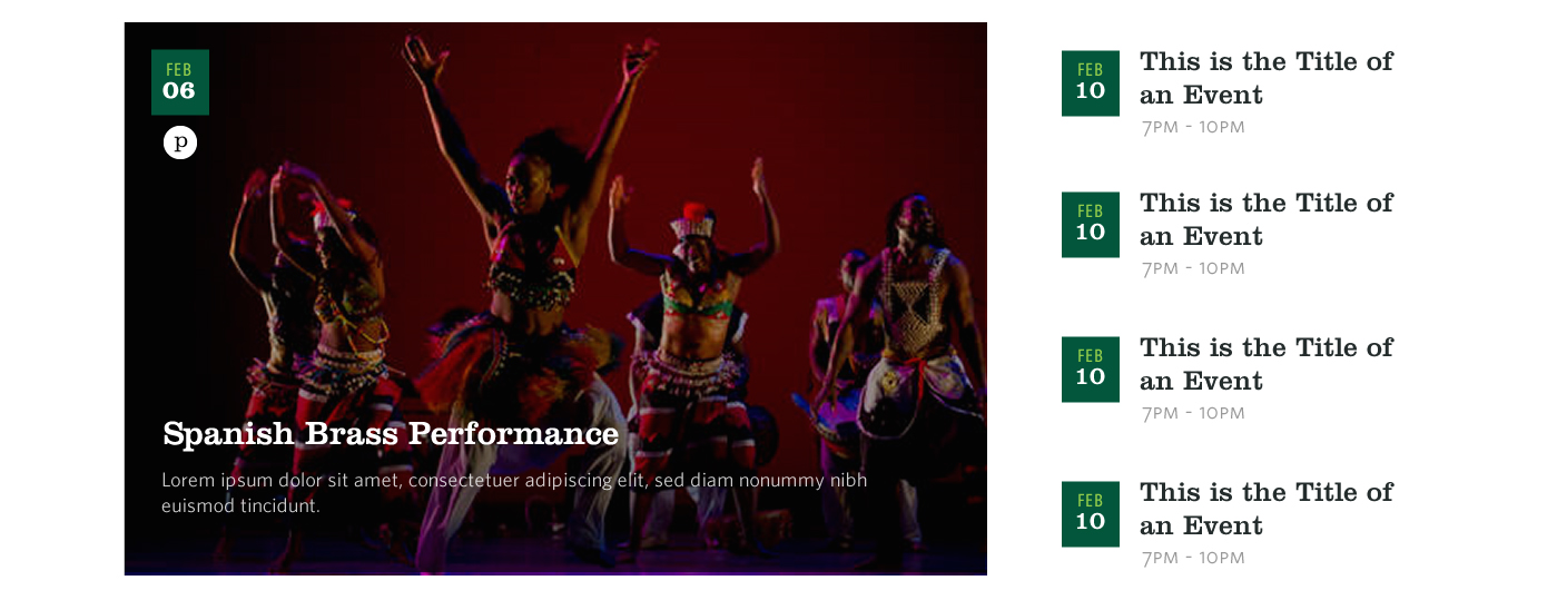
Upcoming Events images should always:
- Help support the content of the event by being in-line with the subject matter (location, specific program, etc)
Upcoming Events images should not:
- Inhibit overlaid text with busy composition
Library Header Images
1300x600 (minimum size)
Shot Q provides visual reference for the style of Library Header images that should be included in the site.
Appropriate Usage:

Library Header images should always:
- Include wide, atmospheric, and expansive views of the library
Library Header images should not:
- Focus on one individual as a portrait
Profile Images
600x385 (minimum size)
Shots R and S provide visual reference for the style of Profile images that should be included in the site. Profile images appear as part of the "Academics at Castleton" grid on the homepage (R), as well as the header on the Academics page (S). Profile images will always be overlaid with a dark gradient, as well as a quote and a name caption.
Appropriate Usage:


Profile images should always:
- Focus on one individual as a portrait
Profile images should not:
- Inhibit overlaid text with busy composition
Major/Minor Images
1250x475 (minimum size)
Shots T, U, and V provide visual reference for the style of Major/Minor images that should be included in the site. Major/Minor images appear as part of the "Academics at Castleton" grid on the homepage (T), as thumbnails on the Majors & Programs list (U), and as header images on their individual department detail pages (V). Department Header images will always be overlaid with a dark gradient, as well as the department title and a brief introduction.
Appropriate Usage:
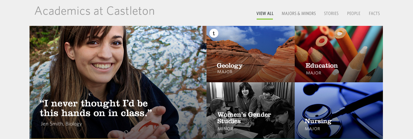


Major/Minor images should always:
- Help support the content of the major or minor by being in-line with the subject matter
- Include wide, atmospheric, and expansive views, or
- Include detailed close-ups of relevant subject matter
Major/Minor images should not:
- Focus on one individual as a portrait or a group of people
- Inhibit overlaid text with busy composition